Showing posts with label UI design. Show all posts

Monday, 25 April 2022

Some Templates for Decent Sampler Background Graphics Creation

When Decent Sampler first appeared, I created some graphics template files to help me create the background graphics for the User Interfaces (UI) that I am now notorious for... (Oh, and as a bonus, you get lots of helpful hints for the UI design as well. Double value today!)

This seems like a good time to share them, so that other people can make overly-detailed, cramped UIs so that mine look ordinary by comparison. The files can be downloaded from my Google Drive (links as the end).

Newest files first, then the archive of the pre Version 1.0.7 material (yep, I've been using Decent Sampler for quite a long time!)

Latest files
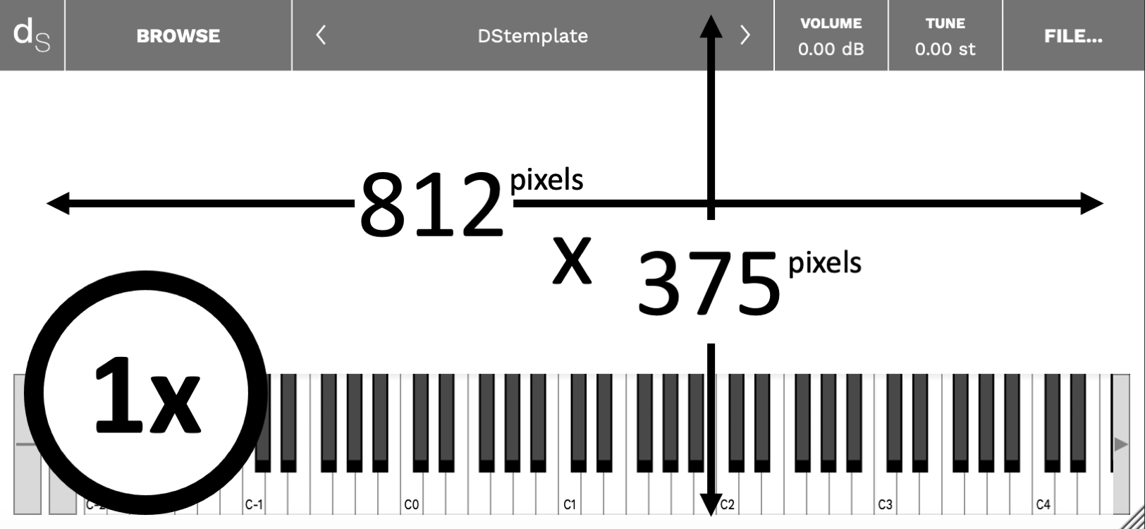

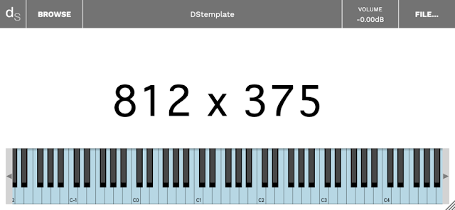
Background first. A .jpg or .png. A photo, or artwork. (Trying to get a moving background with a .gif is pointless, by the way, as are .mp4 videos!) So 812 x 375 is the space you have to work with, but note all that screen furniture that will obscure your artwork or photograph excellence. The '1x' is a clue that you can prepare your graphics either at 1:1, or at double size (1824 x 750) - Decent Sampler will adapt accordingly.

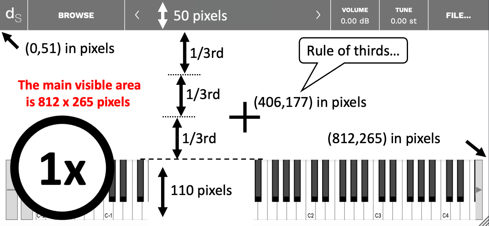
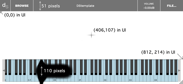
The top bar is 50 pixels tall, and the keyboard area at the bottom of the window is 110 pixles high. This gives a visible area of 812 x 265 pixels, plus a little border around the keyboard, pitch bend and mod wheels, and tiny little slivers in between those areas on the top bar. Oh, and the top bar is not totally opaque, so you will be able to see some of your graphics there, but not very clearly. 


Probably the most important thing when preparing your graphics or photo is that cross in the middle. The centre (center) of the visible area is at 406,158 - so that's where your should put your main focus if you want it in the obvious place. Alternatively, if you are into 'placement in photos should split the area into thirds', then you should put it at 812, 177, nineteen pixels lower, because that's two thirds of the way down the visible area. 

One place to avoid is when you split the whole 812 x 375 into thirds, because then it will be at 812, 250, which is only just above the keyboard. It feels more than a little cramped to me...

The Google drive folder contains additional files to make things easier: blank 1x and 2x .pngs, masks for the top bar and the keyboard in a variety of colours, plus alpha (is that a colour, or not?), and some fascinating examples where I have adjusted the levels to reveal some unwanted artefacts that are present in the Decent Sampler graphics. Probably for uber-geeks only, that stuff... 

User Interface


There are two bits of graphics to consider. The background can be prepped in your favourite photo editor (Graphics Converter for me), but the UI is specified in Decent Sampler's .dspreset file, and is XML code that places little bit of user interface (rotary controls, etc.) in the right place. 

Finding the right place for little bit of user interface is vital. You need a starting point first. Somewhere that you and Decent Sampler both know and agree is the corner of the universe. (When I was a kid, I lived only a couple of miles away from a place that was known locally as 'The Centre Of The Universe', so trust me, I know what I'm talking about!) Decent Sampler knows this point as (0,0), and it is just under the top bar, on the far left. Note that the actual top of the background graphics that you made earlier with the help of the diagrams above, is at 0,-50, and is hidden by the top bar. Try putting user interface bits there and you won't see them...


Decent Sampler's zero, zero, (epoch, starting point,...) is in the left corner, just below the top bar. The top bar is 50 pixels tall, but Decent Sampler knows this point as (0,0). So the actual top (hidden by the top bar) is at 0,-50). Try putting graphics there and you won't see them...

Note that you only have 812 x 214 UI Units to play with. I could call them 'pixels', but I'm going to use 'UI Units' since that makes them distinct from the pixels of the background image. For User Interfaces, then I think that the graphics should not be laid out in thirds, I prefer to use halves, and so this time, the actual centre is useful, and it is at 406, 107 in UI Units. If this was an analogue synthesizer, then that is where I would like to have the Cutoff Frequency control for the Resonant Ladder Low-Pass Filter, and in Decent Sampler, then your nearest equivalent might be the low-pass filter cutoff frequency, but the Expression control might be a close contender. 

For a 'Spitfire Audio' look, you could always nudge your main control across to the right a little bit - this is where they put their 'big rotary control' bit:

Spitfire Audio's User Interface (a tiny part of it) for Polaris...

Whilst I'm distracted by thinking of Spitfire Audio, I would like to put in a good word for Polaris, their 'orchestra/synth' melange that I rather like (Er, would it be too much for a 'Wow'! here?), but then I've always like synthesizers and processed audio, and so this joins their other BT project, Phobos' as two of my favourite virtual instruments. Take a look:

Spitifre Audio Polaris


All thoroughly recommended!

But back to User Interface thoughts. Here's a couple of diagrams showing one way to split up that 812 x 214 are into useful divisions:

Horizontal divisions...

Vertical divisions...

Again, and you already knew this, there are more files on the Google Drive, including ones that show how to derive these divisions. Here's the download link:

Tips

The biggest tip I can give for Decent Sampler is to use <control> and <label> elements instead of the <labelled-knob> element. Using <control> and <label> elements gives you much more precision and flexibility with the placement of the labels with respect to the control bit, so you have much more 'control' over how your UI looks and 'feels'. I haven't used a <labelled-knob> for a long time!

Tying together the background graphics and the User Interface bits is also a good idea. They should work together, not pull in two different directions. Recently, I have been playing with splitting the UI into sections by using dark and light areas of background:

The 'slightly busy' UI for 'Cyclic Transpositions 01...

Note that you can see the background purple graphics underneath the top bar, as well as in the border of the keyboard. 

---

Pre 1.0.7

Yep, not unlike Russian Doll Season 2, but this isn't quite a jump into the 1980s...

First off, there are some sized graphics files, in 2x (1624 x 750 pixels) and 1x (812 x 375 pixels):


These deliberately show the on-screen 'chrome' or 'UI furniture': the top bar and the keyboard, because these are areas that you will want to avoid with your background graphics.

---

Then there are the 'magic numbers' that aren't in any of the format documentation (as far as I could see, anyway):


Yep, the top bar is 51 pixels high, and the keyboard (plus the border) is 110 pixels high. They are both 812 pixels wide.

The zero, zero 'epoch' position for the graphics inside Decent Sampler is not the top- left hand corner! it is 51 pixels lower... 

The centre of the UI screen is at 406,107.

The far right hand lower corner is at 812, 214 (just above the keyboard). So your UI graphics have to fit into a rectangular area that is 812 x 214, although the border around the keyboard and underneath the semi-transparent top bar means that some of your graphics outside this area will be visible. 

---

Then there are plain white, precisely sized files that can be used as starting points, again in 2x (1624 x 750 pixels) and 1x (812 x 375 pixels):


The box is the keyboard position. The keyboard does not seem to be semi-transparent, so there's no real  point in putting graphics underneath it!

--- 

Decent Sampler scales graphics files (.png and .jpg files) that are larger that the default 812 x 375, so you can use 2x or larger if you want. This just increases the size of your sample pack and download time (ever so slightly!). 

---

Alongside these graphics files, it may also be worth creating some .dspreset 'template' XML files if you intend to do a UI once, and then publish multiple variants of it with different samples and graphics. 

---

The download area:


---

If you find my writing helpful, informative or entertaining, then please consider visiting this link:

Synthesizerwriter's Store (New 'Modular thinking' designs now available!)

Buy me a coffeeBuy me a coffee (Encourage me to write more posts like this one!)... or...

Buy Me a Coffee at ko-fi.com (Encourage me via a different route entirely...)

Or just tell someone else that there's this amazing blog about hi-tech music...


Wednesday, 15 December 2021

Increment and Decrement Buttons...

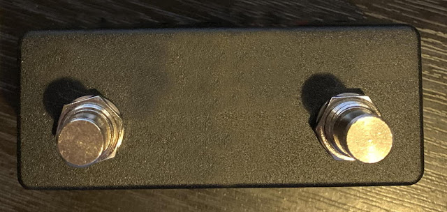
 Sometimes, things jump out at you unexpectedly, and by their very nature, they catch you by surprise. For me, ideas can appear from the most mundane triggers. Here's a recent example, where the inspiration came from a simple two footswitch box:

A simple two footswitch box...

Yep, I've removed the logo from the box... One of the common uses for a two footswitch box like this is to increment and decrement values - so they are used for moving up or down through scenes or cues or programs. depending on the application. Simple and completely straight-forward, and with no room whatsoever for a different way of looking at how they work - or so you might think. 

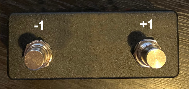
Increment (+1) and Decrement (-1) switches...

Adding labels to the switches makes the intended purpose much more obvious, which is where my brain kicks in and starts analysing...

First thought: Should the +1 be on the left or the right? (and vice-versa for the -1...) Is there a convention for this? (Yes - and I got it correct without thinking when I added the labels and then looked for references as to which way it should be...) The placement is interesting - is the +1 (increment) on the right because the majority of people are right-handed? Curiously, if you rotate the two buttons through 90 degrees then there is no question about the placement - the increment button is in the upper position, and the decrement button is in the lower position. This up/down increment/decrement implication is so entrenched in my mind that I have never questioned it...

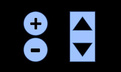
Up / Down and Increment / Decrement

Now the difference between up/down and left/right is related to the way that human eyes work, and is connected to that old question about why mirrors invert images horizontally, but not vertically. Having two eyes separated horizontally is related to widescreen TV and movies, and to why magicians often hide their manipulations above or below a person's eyeline. People rarely look up!

So if up and down, and the implied increment/decrement meaning, are so ingrained, why are left and right not similarly connected? (I do now wonder what would happen if the Up and Down buttons on Lifts/Elevators were reversed? Would people adapt, or just get very confused?) I suspect that there may be some readers who do not agree with my positioning of the increment (+1) button on the right, because they always think it should be on the left. 

Sometimes...


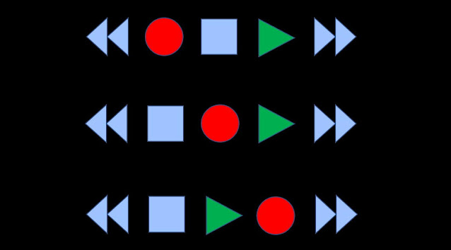
As a historical aside, I can remember always being intrigued by the placement of the 'transport' controls in cassette players in the 20th Century (and it also applies to the transport controls in DAWs, of course). Obviously, fast forward is on the right, fast reverse/backwards is on the left, and Stop should be in the middle, with Play next to it, on the right. But where does the Record button go? On the left, or on the right? 


Looking around my studio, I can see examples of each layout! And when you add in a Pause button, then things get really complicated!

But back to increment and decrement. What really caught my imagination was the limits of buttons like these. Adding or subtracting one is fine for small integers, but what happens when you have more values. Imagine a live gig where you need to select between 10 sounds on a synth or 10 effect settings on an effects pedal. So from number 1, then you can increment all the way up to 10, and decrement back to 1. So from number 1, it will take 9 increments to get to 10, and from 10, it will take 9 decrements to get to 1.

But, if you are on number 1, is there a more efficient way to press buttons or switches to get to number 10? (Or from 10 to 1?)

The answer is probably completely obvious, and you are giggling at me for not mentioning it. When you are at 1, then decrementing takes you to 10, and when you are on 10, then incrementing takes you to 1. Again, the usual expectation seems to be that if you have a range of 10 numbers, then when you increment past the highest value, it 'jumps' down to the lowest value. Conversely, when you decrement 'below' the lowest value (1), then the number jumps to the highest value, 10. So the numbers are arranged like this:

Decrement ...1 2 3 4 5 6 7 8 9 10 1 2 3 4 5 6 7 8 9 10... Increment

This means that the quickest way to get from number 1 to number 10 is to push the decrement footswitch or button. So should the -1 button or switch be re-labelled as +9 when the current number is 1? Or should the +1 button be labelled as -9 when the current number is 10? Of course not, you are thinking. It is obvious! (Please keep your reaction here carefully stored away for future consideration.)

When people say that something is obvious, they often mean that the convention is so ingrained, so much part of common experience, that no explanation is required - it is just 'how things work'. I imagine that companies who make equipment with increment/decrement switches or buttons get very few user complaints about the behaviour of those switches at the highest and lowest values of looping ranges of numbers. 

Unfortunately, my mind doesn't work like this. When I started thinking about the most efficient way of moving between numbers, and thought about having to relabel at the highest and lowest numbers, then a light came on, and an idea popped into my brain...

The Pre-amble


To understand the idea, and to put it in context, let's look at 'efficient selection'. If we want to control the selection of a number between 1 and 10, and we have two buttons, switches, or foot-switches to do this task, then what is the best measure of efficiency? Is it the minimum number of button/switch presses that we need to make? Or the maximum? If the current number is 1, then incrementing takes us to 2, and decrementing takes us to 10. So the minimum number or presses is 1 to get from 1 to a 'target' of 2 or 10. But for a target of 6, then we would need to press the increment 5 times, or the decrement 5 times, to get from 1 to 6. So the maximum number of presses required is 5. 

(I'm not going to talk here about Fitt's Law, which is one of the fundamentals of User Interface or Interaction design, or various other 'Laws'... But suffice it to say that there are all sorts of analogies and correlations that can be drawn with various formal ways of approaching and characterising this sort of problem...)

In terms of 'annoyance', then I reckon the maximum number is the one that matters. Having to press a button (or switch) once to go from 1 to 2 is fine. Pressing it twice to go from 1 to 3 is also okay. But 5 presses to go from 1 to 6 is beginning to be 'too many' presses. There's a set of sloppy descriptors that you could use for the number of button presses required:

One, two, too many!

5 is probably solidly in the 'Too many' category. And that's probably where most people would leave it, because for 10 possible numbers, then obviously it will take between 1 and 5 presses to get to any of them.

Except it doesn't, as it turns out...

My brain looked at those two re-labelled buttons, for -9 and +9, and, as I said, a light came on in my head. It suddenly struck me that there was a better way to control the selection of a looped set of numbers, and it requires just a minor change to one of the two buttons...

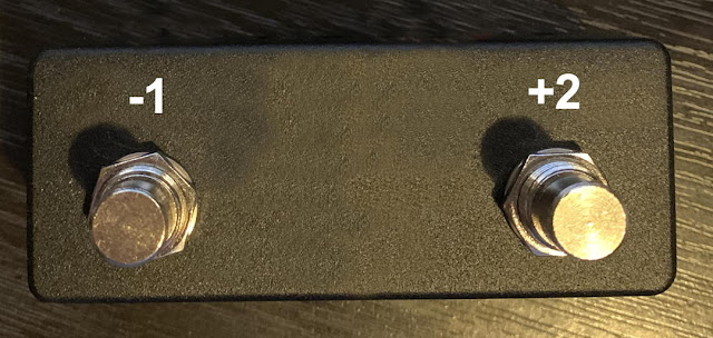
All you need to do is change one of the two increment or decrement buttons/switches/footswitches to be double the amount. So a +1 would become a +2, or a -1 would become a -2. Whichever you change, you leave the other button alone. So, assuming that we double the increment, you would have two buttons: -1 and +2.


Suppose we start at 6 as the current selected number. We can decrement to 5, decrement again to 4, decrement again to 3, and decrement again to 2, and finally, decrement again to get to 1. That's five (5) presses of the button/switch/footswitch. But suppose we use the double increment button? 6+2 takes us to 8, and another 2 takes us to 10, and another 2 takes us to 2. If we then decrement we get to 1. That's four presses. 

So the maximum number of presses required to move from any number in a looped list of 10 numbers using two buttons is not 5 - it is 4 (four)! To me, four is less solidly in the 'too many' set, and it is definitely less than 5! 

Exploring more formally how this works, here's a table that shows different looped lists of numbers, plus the maximum number of presses required to move from one number in the list to another...

Maximum number of presses with the +1,-1 scheme...


So the simplest case is on the left hand side - in the second column (with a zero at the top): a looped list consisting of 1 number requires zero presses to get to the same number. The next column across, with the 1 at the top, is for a looped list of 2 numbers, where it takes a maximum of 1 presses to get to the other number. This continues across to the right, until we get to the right-most column, where it takes a maximum of 6 presses to get from a looped list of 13 numbers to any other number in the list. This table considers only the 'usual' increment and decrement values or +1 and -1, which, for want of a better word, I call a 'scheme'... I went all the way up to a list of 13 numbers to check that the case of 10 numbers is not a special 'edge' example. Note that the maximum number of presses (increments or decrements) is the integer value of half of the numbers in the looped list. So for 13 numbers, half is 6.5, and the integer value is 6. 

For other schemes, then the table has more columns:

Maximum number of presses with other schemes...

What is interesting now is that for a looped list of 9 numbers, then the +2,-1 scheme makes no difference - the maximum is still 4 presses. The first looped list of numbers where the +2,-1 scheme has an effect is fo a list of 10 numbers. For lists of more than 10 numbers, then a pattern starts to emerge, where the +2,-1 scheme reduces the maximum number of presses by one, but schemes like +4,-1 do not give an overall advantage. The +2,-1 scheme thus seems to be the optimum scheme, at least with these small numbers. I haven't done any deeper analysis...

Summary

The maximum number of presses required to move from any number in a looped list of 10 numbers using two buttons is four (4), not five (5) as you might expect. I wasn't able to find a scheme that gave any better results than four, but my searches were not exhaustive. I have not been able to find any information on this topic on the InterWeb, but trying to express this sort of study in words is not easy, and searching for this type of thing is not very reliable. I hope that by posting on this blog, someone who knows more about this topic might find it, and if so, I would be very interested in learning about any published research that is available.

Regardless of the 'state-of-the-art' in UI or Interaction Design , I now have an interesting alternative to the usual +1/-1 increment/decrement buttons/switches, and I'm going to continue investigating it. Also, anyone who reads this blog now knows how to do it as well, and it will be interesting to see what happens over the next few months...If you do use this idea, then an acknowledgement of the source would be good. Thanks.

---

If you find my writing helpful, informative or entertaining, then please consider visiting this link:


Synthesizerwriter's Store (New 'Modular thinking' designs now available!)

Buy me a coffeeBuy me a coffee (Encourage me to write more posts like this one!)